
Overview
At Kastelo, a fintech focused on accessible digital financial services, the work centred on leading UX and UI design for the core mobile app. The product enables users to manage and grow their money in a single secure wallet, with responsibility spanning experience strategy, product vision, and end-to-end execution.
Year: 2025-2026
Company: Kastelo
Role: Lead UX/UI Designer
Industry: Fintech
Design Challenges
The design challenges focused on improving clarity, reducing compliance friction, and increasing engagement within complex financial journeys.
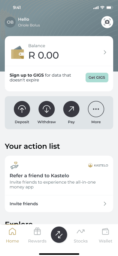
Creating a homepage that clearly orients users and drives meaningful action
Insight
First-time users often land on a wallet homepage unsure of what to do next, increasing cognitive load and reducing engagement.
Solution
We designed an action-led homepage that surfaces core features, highlights key or time-sensitive actions, and supports easy exploration. It functions as a clear command centre, reducing uncertainty and improving task completion.
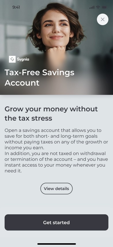
Simplifying onboarding and document signing for a tax-free savings account
Insight
Compliance-heavy journeys increase friction through multiple steps, legal content, and decision fatigue, leading to drop-offs.
Solution
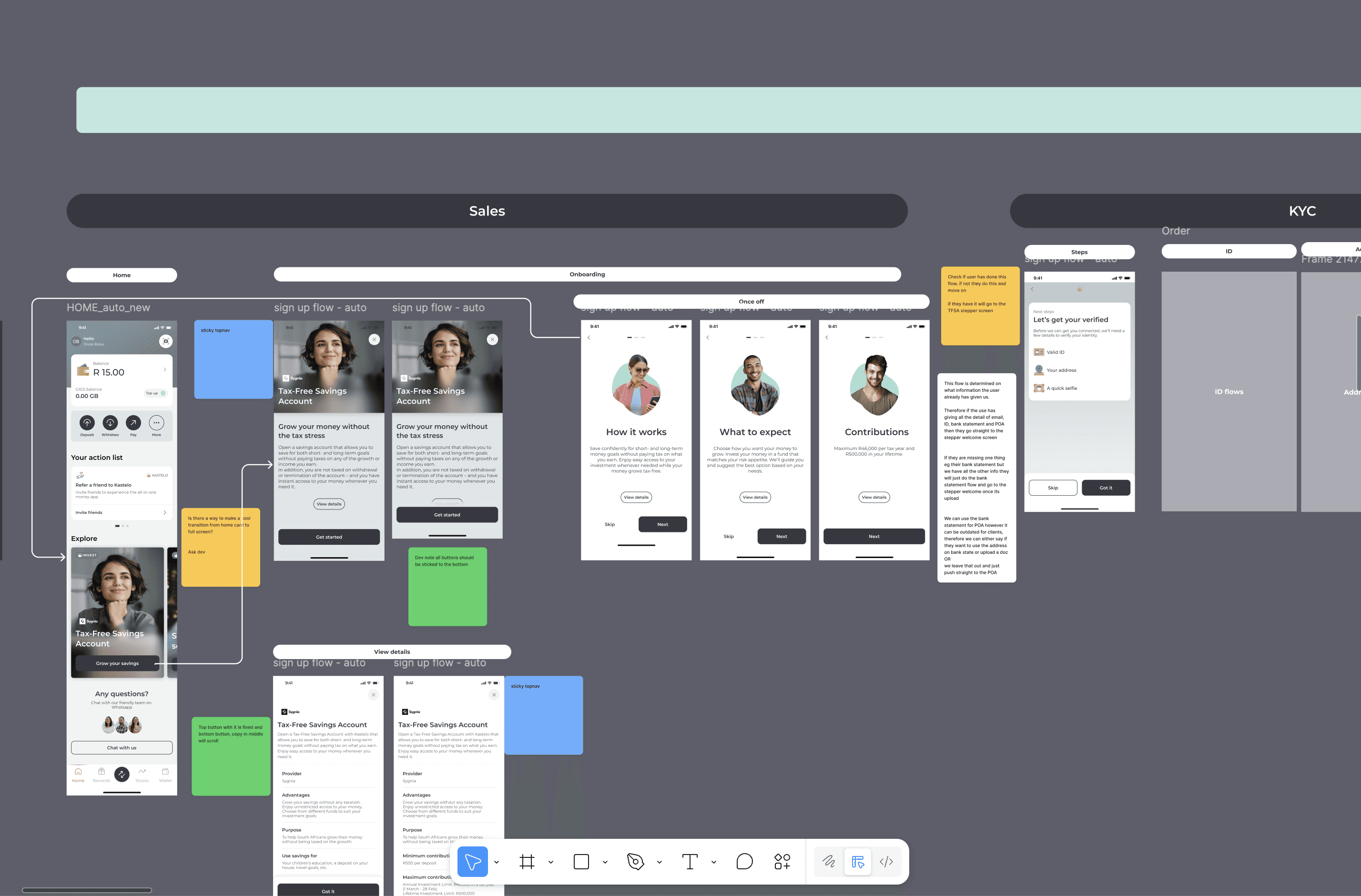
We created a structured onboarding flow using progressive disclosure, clear step-by-step progression, simplified legal content, and streamlined high-friction actions like fund selection and document signing.
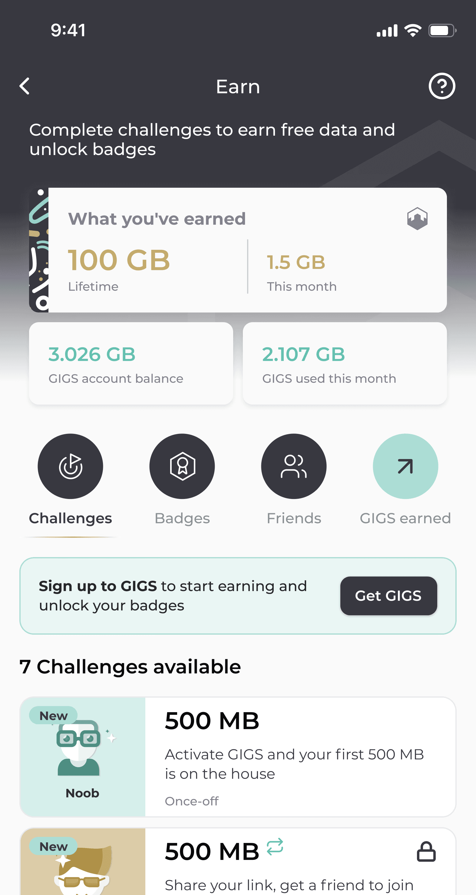
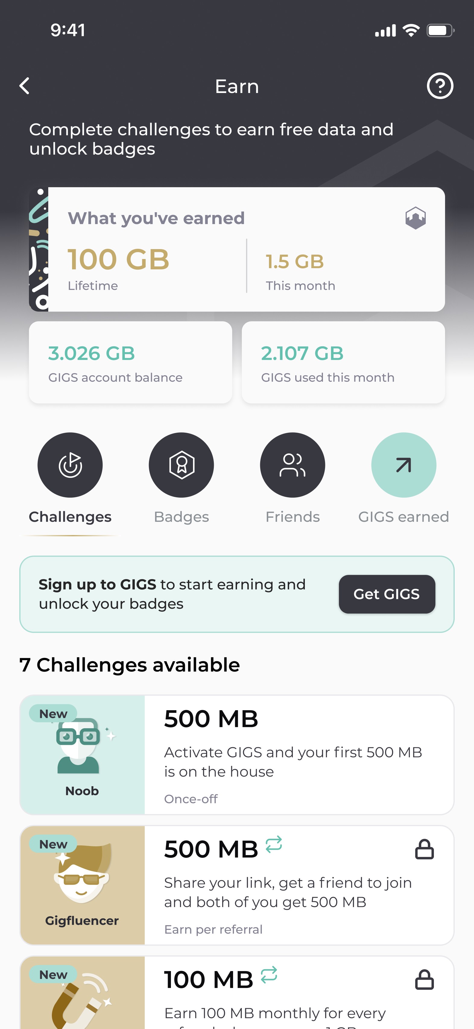
Encouraging sustained engagement through behavioural reward mechanisms
Insight
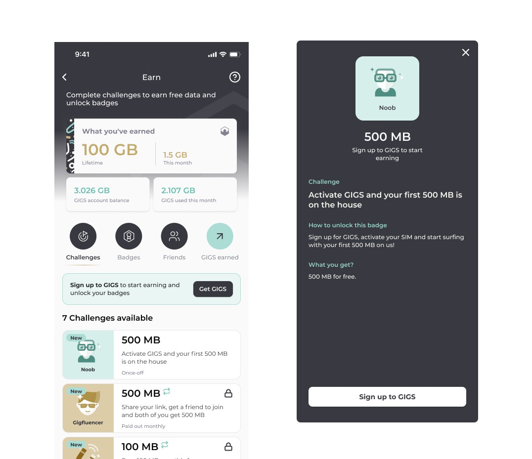
Reward systems are most effective when they create progression, status, and visible achievement rather than isolated incentives.
Solution
We introduced a challenge-based rewards model with task-based progression, unlockable benefits, and collectible badges to drive habit formation, engagement, and long-term loyalty.
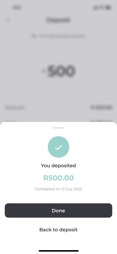
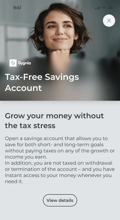
Mobile patterns were designed to guide users clearly while allowing access to additional information when needed
Design Features
Key features of the Reimagine project
Send, exchange & Receive Money
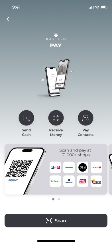
A friend needs cash. Someone owes you for dinner. Move money instantly with Kastelo Pay.
Pay Seamlessly With
Zapper
Kastelo Pay connects with Zapper at more than 30,000 stores nationwide. Scan. Tap. Paid.
GIGS network and rewards
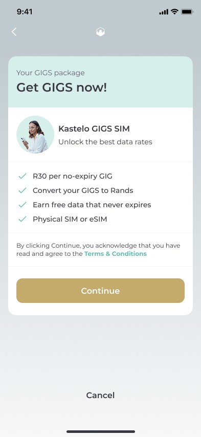
Kastelo GIGS offers, no-contract,, and non-expiring data for R30 per GB. In addition, you can earn rewards for everyday tasks and build up personalised badges.
Investments
Integrated products such as stocks and Sygnia Tax-Free Savings account allow you to grow your money with the Kastelo ecosystem.
Standardised mobile interactions, such as the fixed action buttons at the bottom of the mobile screen, address usability and responsive design challenges while creating a predictable, ergonomic experience for users
Design system
A scalable design system was introduced to replace a basic style guide. Foundational components, patterns, and interaction principles were defined, with design variables standardising colour, spacing, and typography to ensure consistency and flexibility across the app.
Establishing a structured component framework
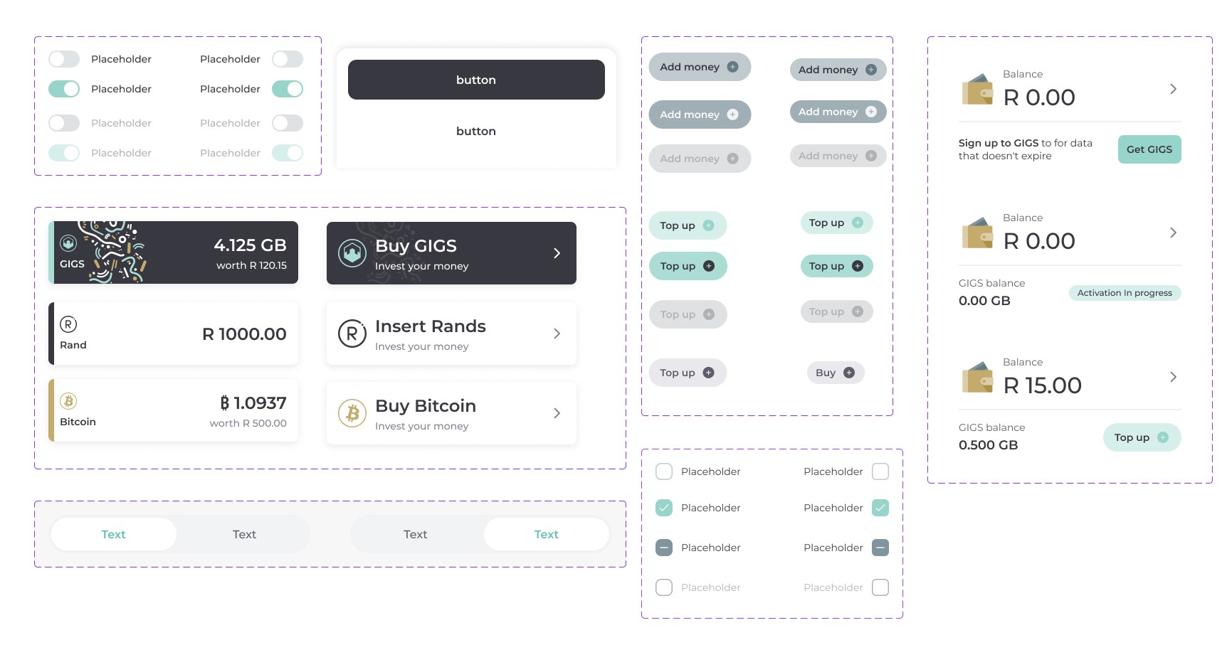
A modular card system was established as the core UI building block. Built with Auto Layout and clear rules for spacing, hierarchy, and responsive behaviour, it created a consistent yet flexible structure across financial use cases.
Standardising visual Language
Design tokens were introduced to align colour, typography, and spacing across components. A subtle background layer improved hierarchy and visual separation, reducing noise and increasing clarity.
Defining usage patterns & behaviour
Repetitive UI patterns were identified and consolidated into clear usage rules. This reduced duplication, clarified when components should be used, and ensured the system supported cleaner, more intentional flows.
Mobile-first interaction standards
Key mobile interactions were standardised, including fixed bottom actions and improved thumb-reach ergonomics. This made primary actions consistently accessible and improved task completion across flows.
Design system components were created to support various states and align with mobile app patterns.

Variable tokens
Style guide
Journeys and flows
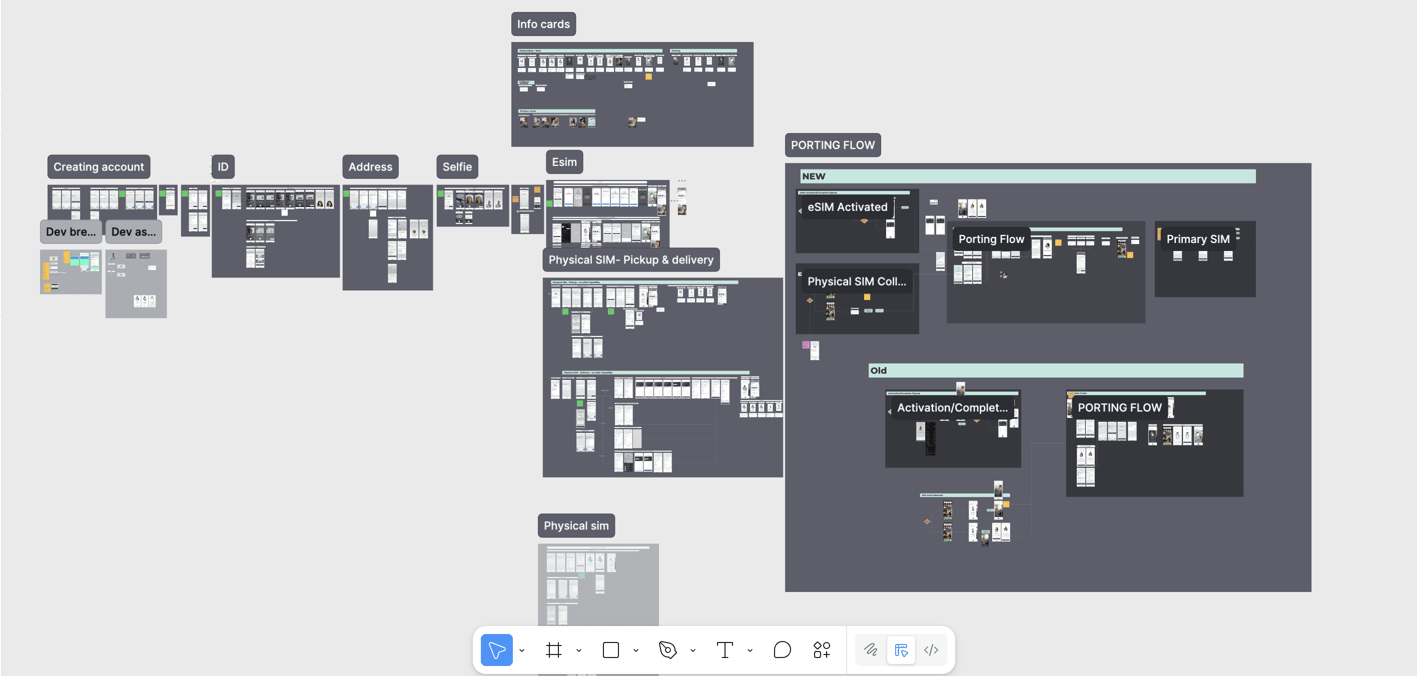
Defining user flow logic through flows, wireframes, and higher-level journey mapping.
Ilustration and motion development
Testing journeys with users to refine and improve workflows.